


INTRO
This project is a rebrand of Sun Rice Cracker, a traditional Chinese snack brand founded in Xi’an, China in the 1980s. The rebrand focuses on modernizing the brand’s visual identity while preserving its cultural roots and heritage.
The goal of this project is to help Sun Rice Cracker expand into the international market, connect with younger consumers, and strengthen its brand presence through refreshed packaging, branding, and marketing design.


CHALLENGES
The brand struggles to compete with fast-growing digital-native brands in terms of visibility, audience reach, and brand awareness.
Sun Rice Cracker’s outdated brand image makes it difficult to connect with younger consumers and remain relevant in today’s market.
The brand also has a weaker retail presence and lower profit margins compared to competitors, limiting its overall growth and market reach.
The rebrand focuses on strengthening Sun Rice Cracker’s digital and social media presence to increase brand awareness and expand its reach within the international market, particularly in Canada.
Introduces a more modern and visually engaging identity designed to better appeal to younger audiences while maintaining the brand’s cultural roots.
Improve product visibility and market positioning through refreshed packaging and cohesive branding to support stronger consumer recognition and business growth.

Define
Limited digital presence, with content primarily available through a Chinese-only website and Douyin, reducing international accessibility:
Inconsistent visual identity across brand touchpoints
Outdated website content and interface design
Weak layout structure, visual hierarchy, and low-contrast typography affecting readability
Limited emotional storytelling, reducing brand connection with audiences


Sun Rice Crackers has strong shelf presence at T&T, often positioned at eye level with two rows across different flavours.
However, the packaging lacks sufficient structural distinction and visual impact, causing it to blend into surrounding products on the shelf.
Low shelf visibility due to small logo and weak brand recognition
No clear focal point; striped design makes it feel more like candy packaging
Poor functionality as the package is difficult to reseal once opened
Low slogan readability due to weak contrast and Chinese-only text
Weak information hierarchy caused by a busy background design

Brand analysis
Adobe Firefly Produced Image

Brand Story
Rice Cracker (also known as guoba) originated from the crispy rice crust left at the bottom of a pot, traditionally consumed to avoid waste
It gained nationwide popularity in China during the 1980s–1990s
Adobe Firefly Produced Image

Brand USP
Strong sense of nostalgia, carrying childhood memories and cultural comfort for the 1990s generation
Made with rice, soybeans, and corn, positioning itself as a healthier snack choice
Market analysis
Competitors
In the healthy snacks market, accessibility and emotional connection are key drivers of success, including pricing, packaging, and availability.
Consumer preference is also strongly influenced by how well they resonate with a brand’s story and image, which builds long-term loyalty.

Ideate

With the brand’s strengths in mind, I want to emphasize its nostalgic image rooted in 1980s–90s memories. This led to this big idea of encouraging younger audiences to connect with their parents through shared experiences of the snack.
The Big Idea:

Design
These are the colours extracted from the original packaging by using Adobe Express. I decided to work with the primary colours to preserve the brand’s visual identity.

I began by redesigning the logo through experimenting with different sun-inspired shapes, then explored ways to translate the metaphor into illustration that connects back to the big idea.
Logo mockups

Package redesign
After refining the logo, I moved on to redesigning the packaging. I retained the idea of using different colours to represent each flavour and continued to build the design around this system.

Design outcome
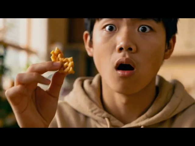
Photoshoot


Marketing strategy
Nostalgic Taste That Connects Generations
Short-form content on Instagram Reels, TikTok, RedNote, and Douyin helps engage younger audiences across global and Chinese markets while reinforcing Sun Rice Crackers’ nostalgic identity of sharing the taste their parents grew up with and bringing families together. This insight informed the following marketing strategies:
Advertisement
Created Using GenAI: Adobe Firefly
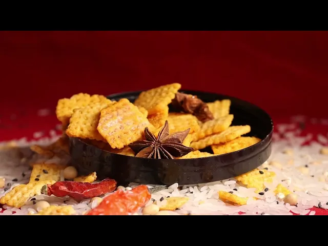
Self-Produced Video


